User Journey + Data Layer
Situation: When I first joined Hotelplan Group, my design team almost never looked at performance data nor data seen within our analytics platforms. I quickly organised a tutorial to have the team learn how to create exploration funnels to better understand our pain points.
Initial Assessment
1st looks:
As we are trained to objectively identify good usability and spot bugs wherever they may be, the very first step we take is to mimic an average customer journey to complete main tasks that are specific to the business model.
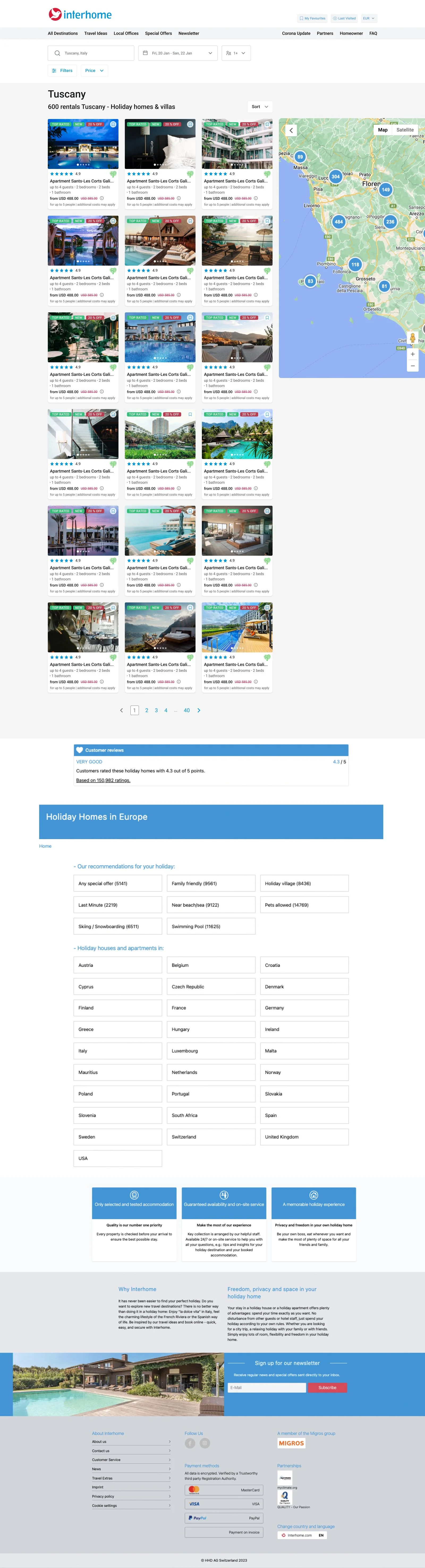
Since majority of our businesses are travel based, the common customer journey has an Exploration phase, an Intention to buy and finally Customer Care after purchase (as does most e-commerce)
Heuristic Analysis + Competitor Benchmarking:
There are 10 main criteria for good usability but this can easily expand to up to 20 measures for assessing if a platform/product has ease-of-use
After doing the Heuristic analysis, it’s important to get a sense of how direct/indirect competitors are achieving seamless functionality and have approached their “problem” or feature-use
Data + Exploration Funnels
The Basics:
When first viewing data within GA4, we would get a basic sense of device category split, user attributes, amount of traffic and the sources
If Personas or reporting didn’t exist then we would start to document our findings so that we can start to build up our analysis
Exploration Funnels:
This may exist or more than likely in a way that doesn’t suit a Product Designers needs so we would duplicate CRO reports and those from Web Analysts to begin to modify them so we can dive deeper into where pain points exist to then be validated by BI team or the like
Main focus for our teams was the usual customer journey that is: Home > Search Result page > Product Detail page > Checkout flow (which usually has up to 4 steps)
Important to note: we found it necessary to create various paths because for most of our Products, SEO/SEA traffic was guiding users directly to Search or a Product page which would affect our analysis and help identify what pages have the most impact
Heatmaps & Beyond
Clarity:
For most of our Products, we use Clarity to access our heatmaps. This suffices in such a way that we, at least, can see areas of interest and scroll depth of our most important pages. With this, we can validate our hypotheses that we created when doing our initial analysis
Glassbox:
We have the benefit that 2 of our Products are utilising Glassbox to accurately create reporting about performance
While the analysis tool is quite expensive, the value it brings theoretically surpasses it’s price tag
The capabilities of the tool allows us analyse paths and clearly identify when a user is in their “exploration” phase of the customer journey to then also validate conclusions we made when looking at Google Analytics
Summary
How can one possibly synthesise all of this info?
It’s important to consider the context/intention of all of this initial analysis
Full Presentation — either for stakeholders or Product Managers
Concise User Flow — for a Product Manager to show high level areas of interest when discussing Roadmaps etc.
Full Presentation:
Keep in mind the audience you are presenting to / who will be receiving the document itself
As we know, average attention span is quite low therefore, it’s important to only focus on the most critical issues while still carrying a narrative throughout your explanation of the user journey
Before presenting, it would be wise to show your data science team the results of your analysis to get their confirmation that the data is correct
Concise User Flow (seen here):
This can be done quicker as it usually takes the form of a diagram showing each stage of the customer journey and listing key features on that page that should be a focal point of improvement as it would have the biggest impact